Root-Cause-Analysis of multiple KPIs
Unlock root-cause analysis across multiple KPIs with BoostKPI’s heatmap feature. Visualize revenue drivers, from AOV to order growth, all in one place.
Motivation for KPI-Heatmap
In the ever-evolving landscape of Direct-to-Consumer (D2C) commerce, understanding the driving forces behind your revenue trends is not just advantageous, but essential. As a D2C business owner, the ebbs and flows in your weekly revenue metrics are more than just numbers; they are a narrative of your business’ performance and potential. When you notice an uptick in your web channel’s weekly revenue, you want to know why? Was this spike a result of increased orders, or had the Average Order Value (AOV) climbed? Delving deeper, if it was the orders, was the surge driven by a rise in product views or was it the order conversion rate showing promise?
What does the KPI-Heatmap do?
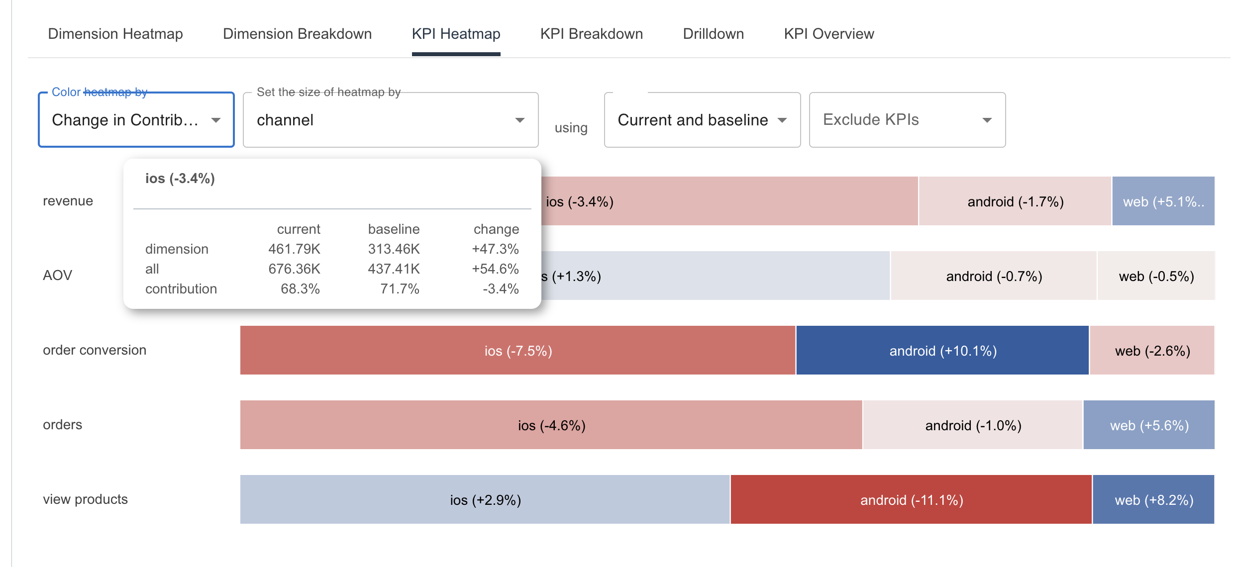
Enter our newly introduced KPI-heatmap feature, a tool designed to untangle such intricate data threads. This feature allows you to dissect your Key Performance Indicators (KPIs) by any dimension of your choice. The heatmap is colored by percentage change—blue indicating an increase, and red, a decrease. The size of each segment in the heatmap corresponds to its contribution to revenue, making it easy to visually focus on the important segments.
Illustrative Video
Switching the dropdown from percentage change to change-in-contribution unveils the relative change, offering a nuanced understanding of your revenue dynamics. The illustrative video showcases how effortlessly you can pinpoint what propelled the revenue increase. In the video, revenue is the product of AOV (Average Order Value) and orders. Orders in turn is a product of view products and order conversion. The key steps in the video are:
- Imagine a user is looking at the Dimension Heatmap for revenue and wondering what drove the 42% increase in revenue for android.
- Click on the channel link in the Dimension Heatmap.
- Hover on the android cell. All the android cells are highlighted. Look below to see that most of the increase is coming from an increase in orders.
- Orders in turn increased mostly due to an increase in view products, with a negligible increase in order conversion.
- Change color heatmap dropdown to change-in-contribution to see the relative increase across channels. Relative to other channels, view products for android has weakened whereas the order conversion for android has strengthened.
- Change the dimension dropdown to continent to repeat the analysis for different continents.
Application to Other Verticals Beyond D2C
The applications of the KPI-heatmap feature extend beyond D2C businesses. For instance, in the realm of paid marketing campaigns, evaluating the Return on Ad Spend (ROAS), Customer Acquisition Cost (CAC), and Lifetime Value (LTV) becomes a breeze. These crucial metrics can be broken down by any dimension, providing a granular view of your campaign’s impact. Whether you are assessing the effectiveness of different marketing channels or understanding consumer behavior across demographic segments, the KPI-heatmap is your companion in unveiling actionable insights.
Similarly, for those navigating the AdTech exchange sphere, the KPI-heatmap is an indispensable ally. If a DSPs revenue increases, you can see whether it is due an increase in CPM or increase in impressions. If it is impressions, is it due to the DSP placing more bids, or winning a proportionally large number of bids.
Wrapping Up
For almost every business, the KPI-heatmap is not just helpful, it is essential to understanding the ever-changing relationship between the various KPIs and making informed decisions. So the next time you notice a dip in your revenue, use the KPI-heatmap to help you turn those numbers into stories that can steer your business.