Visualizing changes in derived metrics
Explore advanced heatmap visualizations for derived metrics like ROAS and CPC, understand why they are hard to analyze, and learn why BoostKPI’s approach works.
BoostKPI offers a heatmap visualization to data scientists, enabling them to swiftly detect significant KPI changes in granular segments during on-demand root cause investigations. In this blog post, we will delve into how our heatmap handles analyzing derived metrics like ROAS (revenue/spend) or CPC (spend / clicks) where changes in their underlying simple component metrics can have an unexpected effect on the overall derived metric. For instance, a rise in the ROAS of an underperforming ad campaign can lead to a drop in the overall ROAS if the spend for the underperforming campaign increased.
The BoostKPI Heatmap
Let’s start with the basics of our heatmap visualization. During an investigation, the user selects an investigation period and a baseline offset that together define a current and baseline time period for comparison. The user can then move to the heatmap tab to view KPI changes in dimension values.
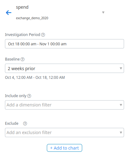
For example in one of our demo datasets, a user could investigate change in spend by first selecting an investigation period of Oct. 18th, 2022 to Nov. 1st, 2022 and an offset of ‘2 weeks prior’ to compare the total spend from Oct. 18th, 2022 to Nov. 1st, 2022 with the total spend from Oct. 4th, 2022 to Oct. 18th, 2022.
Each row of the heatmap corresponds to a dataset dimension, with cells corresponding to each dimension value. The default size of each cell reflects the sum of the KPI’s current and baseline totals restricted to that dimension, while the default color represents the percentage change from the baseline total to the current total.
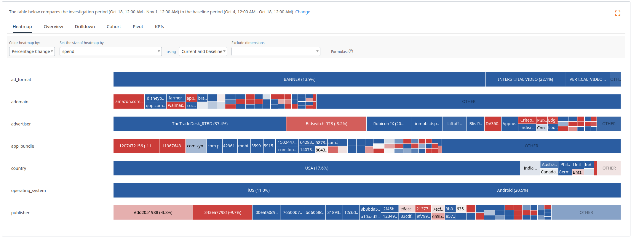 This heatmap displays the changes in spend between the investigation period and the baseline.
Hovering on a heatmap cell displays the KPI values for the cell’s dimension value along with the overall KPI totals for the current and baseline time periods.
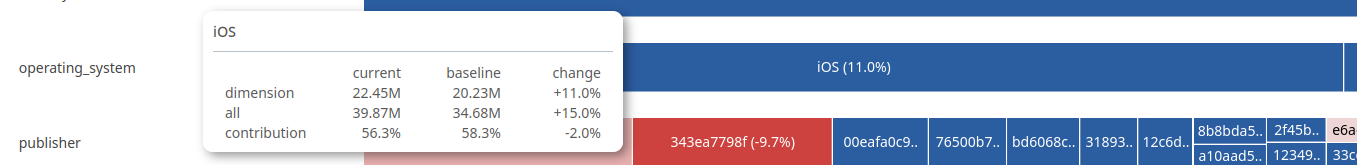 Exact KPI totals and changes can be seen when hovering on a heatmap cell.
Our heatmap also supports coloring by ‘Change in Contribution’, which colors the heatmap cells based on how their proportion of the KPI total has changed between the baseline and investigation periods. This color selection is particularly useful if there has been a large change in the overall KPI value, e.g., if your business is growing and revenue increased 50%, then it is likely that almost all of the heatmap cells will be colored blue! In such cases, the ‘Change in Contribution’ coloring will help identify over and under performers by showing which dimension values have increased/decreased more than the overall change.
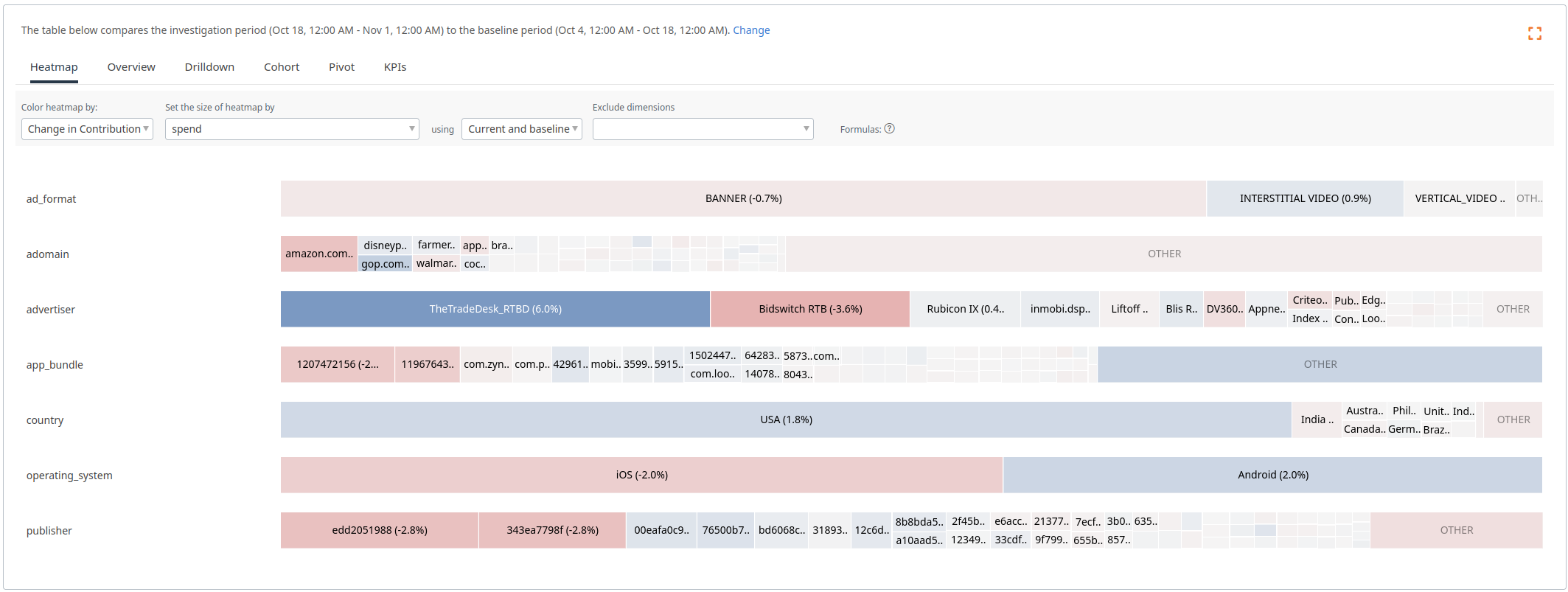 In the previous image, most of the cells were blue, because spend had an overall increase. In this heatmap, we can see which dimensions values are driving the change (advertiser TheTradeDesk_RTBD, country USA, operating system Android) and which are lagging behind (advertiser BidswitchRTB, operating system iOS, publishers edd2051988 and 343ea7798f).
The Challenge
However, investigating derived metrics using the same heatmap logic for simple metrics produces poor results. Let’s look at CPC broken down along the brand dimension as a concrete example. We will use \(X_t\) for the overall value of KPI \(X\) over time period \(t\), we will use \(t=0\) for the baseline and \(t=1\) for the investigation time period, and \(X_{t,d}\) to represent the value of \(X\) for dimension value \(d\) over time period \(t\), e.g., \(CPC_t = SPEND_t / CLICKS_t\).
Consider the following situation:
\[\begin{array}{|c|c|c|c|} \hline & SPEND_{t,d} & CLICKS_{t,d} & CPC_{t,d} \\ \hline t=0, d=android & 1 & 10 & 0.1 \\ \hline t=1, d=android & 3 & 22 & 0.13636...\\ \hline t=0, d=iOS & 1000 & 4000 & 0.25 \\ \hline t=1, d=iOS & 1001 & 4003 & 0.25006...\\ \hline t=0, overall & 1001 & 4010 & 0.24963... \\ \hline t=1, overall & 1004 & 4025 & 0.24944... \\ \hline \end{array}\]In this example, there are a few challenges for the heatmap. First, what size should we assign the cells for android and iOS? If we size by the CPC, then android will be twice as big as iOS despite having tiny SPEND and CLICKS. Second, what color should we assign the cells when interested in ‘Change in Contribution’? The CPC for android has increased, but this has caused a decrease in the overall CPC. This decrease in CPC occurred even though both operating systems had a CPC increase!
To address this issue, we aimed to use new formulas for cell size and color that are in alignment with users’ intuition developed while viewing simple metric heatmaps. Our goals were to assign cell sizes based on the dimension value’s ‘importance’ and to compute the ‘Change in Contribution’ color so that users could understand how the changes for the cell’s dimension value affected the overall KPI value.
Better Cell Sizes for Derived Metrics
A first natural attempt to size heatmap cells for derived metrics is to set the size proportional to the sum of the numerator and denominator metrics. This can work well for some derived metrics, but produces poor results when the numerator and denominator are very different magnitudes like in this example:
\[\begin{array}{|c|c|c|c|} \hline & SPEND_{t,d} & CLICKS_{t,d} & CPC_{t,d} \\ \hline t=0, d=android & 5 & 1100 & 0.004545... \\ \hline t=1, d=android & 15 & 1100 & 0.013636... \\ \hline t=0, d=iOS & 95 & 900 & 0.1055... \\ \hline t=1, d=iOS & 85 & 900 & 0.0944...\\ \hline t=0, overall & 100 & 2000 & 0.05 \\ \hline t=1, overall & 100 & 2000 & 0.05 \\ \hline \end{array}\]Summing the numerator and denominator for this example, the cell for android will be slightly bigger (5+1000+15+1000=2020) than the cell for iOS (80+900+100+900=1980), but iOS has roughly ten times the CPC. Because it is responsible for more of the overall CPC, users generally expect iOS to have a bigger cell size in this situation.
To improve the size formula, we multiply the denominator values by the overall CPC and add the numerators. A simple interpretation of this new formula is that the size for a cell is proportional to the numerator for the dimension value plus the expected numerator for that dimension value given only the denominator. E.g., if the overall CPC is \(1/20\) and the CLICKS for android is \(1100\), then we would expect \(\frac{1}{20} * 1100\) for SPEND. Working through the previous example, we get:
\(CPC_0 = (5 + 95)/(1100 + 900) = 100/2000 = 0.05\) \(CPC_1 = (15 + 85)/(1100 + 900) = 100/2000 = 0.05\)
\(\text{Size for android}: 5 + 0.05 * 1100 + 15 + 0.05 * 1100 = 130\) \(\text{Size for iOS}: 95 + 0.05 * 900 + 85 + 0.05 * 900 = 270\)
With the improved formula, the cell for iOS is roughly twice the size as the cell for android. This approach provides a nice balance between valuing the numerator metric and valuing the denominator metric.
Coloring Derived Metric Cells with Change in Contribution
Matching a user’s intuition for the ‘Change in Contribution’ color of a cell in the heatmap for a derived metric is more challenging. We derived a formula where we separated out the contribution to the numerator and denominator to define a pull:
\[PULL_{t,d} = \frac{SPEND_{t,d}}{SPEND_t} - \frac{CLICKS_{t,d}}{CLICKS_t}\]When dimension value d’s CPC matches the overall, i.e., \(CPC_d = CPC\), then the pull for d is exactly 0. If \(CPC_d > CPC\), then d will have a positive pull and if \(CPC_d < CPC\), then d will have a negative pull. By looking at the change in pull between the two time periods, we get a formula that closely matches our intuition for ‘Change in Contribution’ on simple metrics.
\[\text{Change in contribution for }d = PULL_{1,d} - PULL_{0,d}\]Working through with our example we get:
\(\text{Change in contribution for android} = \left(\frac{15}{100} - \frac{1100}{2000}\right) - \left(\frac{5}{100} - \frac{1100}{2000}\right) = 0.1\) \(\text{Change in contribution for iOS} = \left(\frac{85}{100} - \frac{900}{2000}\right) - \left(\frac{95}{100} - \frac{900}{2000}\right) = -0.1\)
In our example, android has increased SPEND and so no longer pulls the overall CPC down as much and will be colored blue while iOS has decreased SPEND and has a smaller pull up on the overall CPC, resulting in a red color. A dimension value that has positive ‘Change in Contribution’ for CPC has either a) increased the amount it is pulling up on CPC or b) decreased the amount it is pulling down on CPC. This matches the behavior for the simple metric ‘Change in Contribution’ where the colors are normalized to the overall change.
Wrap up
Putting these formulas together, users can more easily investigate changes in derived metrics like CPC:
 A heatmap displaying ‘Change in Contribution’ for CPC. Cell sizes and colors are computed based on the derived metric specific formulas.
Cell size naturally corresponds to the importance of the dimension value and color correctly reflects what cells are driving changes in CPC.